Gallery wall labels are the interpretive interface between an exhibited work and the viewer, combining tombstone data (artist, title, date, medium, dimensions) with brief contextual text to guide active looking. Placement, typography, and production method determine whether a label serves or competes with the art it describes. Dry-transfer rub-on labels — applied without adhesive backing, vinyl film, or visible substrate — produce the seamless, painted-on finish used by institutional galleries and now available for independent exhibitions at any scale.
Gallery Wall Labels — The Curator’s Guide to Invisible Labels & Gallery Graphics

What Are Gallery Wall Labels? (And Why They Matter More Than You Think)
Gallery wall labels are small panels of text placed adjacent to artworks in exhibitions, providing artist name, title, date, medium, dimensions, and brief interpretive context. Known in the museum sector as tombstone labels in their most basic form, they serve as the primary interpretive interface between the artwork and the viewer — guiding attention without competing with the art itself.
Walk into any well-produced exhibition and you’ll notice something: the labels don’t call attention to themselves. There’s no stack of laminated cards, no tape shadows on the wall, no glossy white rectangle competing with the art beside it. What you see is text — clean, precisely placed, sitting flush with the wall as if it was always part of the room.
That effect doesn’t happen by accident. It’s the result of deliberate production choices made long before install day.
Gallery wall labels are the primary interpretive tool curators use to communicate artist identity, object data, and contextual meaning, covering everything from artist identity and creation date to medium and dimensions. Every other decision about label design, production method, and placement flows from that baseline function.
But labels do more than identify. Research using mobile eye-tracking technology found that visitors shift their viewing behavior in measurable ways when contextual text is introduced into the gallery space — following what researchers describe as an “art-label-art” pattern in which the label actively directs visual engagement with the work itself (PubMed). A well-written label doesn’t pull the viewer away from the art. It sends them back to it with better eyes.
The challenge most exhibition producers face isn’t writing — it’s production. Most online resources cover what to put on a label. Very few explain how labels actually get on the wall, or why one production method produces a dramatically different result than another.
The 5 Elements Every Professional Gallery Label Needs
.” Part of a dark-framed painting is visible on the left; the label’s gallery graphics stand out against a light gray wall.")
There is no single universal format required across all institutions, but professional curatorial standards are remarkably consistent. Whether you’re mounting a solo show at an independent gallery or installing a traveling group exhibition, every object label — from art show labels at commercial fairs to institutional museum displays — should include these five elements in a scannable hierarchy.
1. Artist or maker. Full name, typically including nationality and life dates for historical work. For living artists, the birth year is noted (e.g., b. 1974). If the maker is unknown, the geographic region or cultural group is substituted. This is always the first line.
2. Title of the work. Differentiated from surrounding text through italics or bolding. The title serves as a visual anchor for visitors scanning a crowded hang. The Art Institute of Chicago’s label guide notes that titles should reflect the artist’s own convention — including unconventional capitalization or punctuation (Art Institute of Chicago).
3. Date of creation. A single year, a span (e.g., 2019–2021), a circa designation for undated historical work, or ongoing for durational pieces.
4. Medium and materials. Listed in descending order of physical significance for mixed-media work. This element carries particular weight in contemporary practice where the material itself is often conceptually loaded.
5. Dimensions. Height × width × depth, in metric or imperial units depending on institutional convention. The standard measurement is the outer size of the canvas or object itself — the frame is excluded unless it is integral to the work. Include a third dimension for sculpture, installation, and objects with significant depth.
Beyond tombstone data, most professional object labels incorporate a brief interpretive text layer — typically 50 to 100 words — written in active voice with sentences capped at 25 words. The J. Paul Getty Museum’s guide to interpretive materials specifies that didactic text should present one to three focused points designed to foster close looking, not summarize the artist’s full biography (Getty).
Optional but common additions: credit line or provenance, accession number, and — in commercial gallery and art show settings — selling price.
Size, Font, and Placement — The Standards Curators Actually Follow
, font size (at least 18pt), line spacing (1.5), and measurements. A wall illustration shows a label centered 54 in (1,370 mm) above the floor.")
Getting the size, font, and placement right matters as much as the text itself — and each is governed by institutional guidelines that go well beyond personal preference. Leading museum standards move past minimum ADA compliance toward universal design, ensuring accessibility for all visitors regardless of mobility or vision.
Typography. Sans-serif typefaces — Helvetica, Arial, Verdana, Calibri, Frutiger — are the professional standard for body copy. Smithsonian Guidelines for Accessible Exhibition Design advise against condensed weights, extreme stroke variations, and letter pairs that are visually ambiguous (like I, l, and 1) (Smithsonian / THC). All-caps body copy is explicitly discouraged: it forces readers to process rectangular text blocks rather than word shapes, reducing reading speed. Italics should be reserved for artwork titles only.
Font size. Minimum 18 points for body text. Smithsonian Guidelines for Accessible Exhibition Design set the acceptable wall label text range at 16 to 20 points, with proportional scaling required when architectural constraints push viewing distance beyond one meter (Smithsonian / THC). Line spacing should be set to at least 1.5, with double spacing between paragraphs.
Contrast. A minimum contrast ratio of 4.5:1 between text and background — consistent with WCAG guidance applied to physical signage — ensures legibility under varied gallery lighting. Dark text on a light background is the default; reversed type (light on dark) requires increased letter spacing and heavier font weight to maintain readability.
Placement. Smithsonian guidelines place the optimum wall label centerline at 54 inches (1,370 mm) above the finished floor, with an acceptable range of 48 to 67 inches (1,220–1,675 mm) (Smithsonian / THC). Labels should never lay flat inside deep display cases — the resulting angle makes them unreadable from a wheelchair. Position labels consistently near the object, at a reading height tested in advance, with the same spatial relationship to every artwork throughout the exhibition.
The Problem with Printed Cards and Adhesive Labels
Printed cardstock labels are the default for independent galleries and temporary exhibitions. They’re fast, inexpensive, and require no specialized production — a simple printable gallery label on cardstock, mounted onto mat board or foamcore for a polished look, handles most basic needs. But these methods introduce a set of compromises that become more visible the more carefully the rest of the exhibition is designed.
Standard adhesive backings dry out over the course of a multi-month show, resulting in labels that peel from corners outward — first curling, then fluttering, eventually falling. Velcro mounting, a common alternative, leaves residue and can mark freshly painted walls. Museum professionals in the AAM forum noted that even heavy-duty acrylic adhesive products fail to hold cleanly on painted drywall without eventually causing paint damage on removal (AAM Forum). Foam core substrates absorb humidity and become misshapen. Clear adhesive film picks up raking light from gallery track fixtures, producing a “ghosting” border that makes the edge of the label visible from across the room.
The most common workaround — white cardstock against a painted wall — creates a separate problem. Standard commercial printers cannot output white ink onto a transparent substrate. This forces white cardstock as the only available background, which reads as a bright rectangle regardless of wall color. On the deep, saturated tones that contemporary galleries favor — dark navy, charcoal, forest green — white label cards become the dominant visual element in the room rather than the art beside them.
These are not failures of execution. They are structural limitations of the production method.
What Are “Invisible” Wall Labels? Understanding Dry-Transfer Techniques
Invisible wall labels are dry-transfer rub-on labels applied directly to the wall, leaving only the lettering behind — no paper backing, no vinyl film, no visible substrate of any kind. The text appears as if painted or silk-screened directly onto the surface. The “invisible” effect comes from the complete absence of any carrier material after application.
This effect is produced using dry-transfer technology, also known as rub-on transfers or rub-downs. The Alaska State Museums technical bulletin (1999) documents the use of dry-transfer lettering directly on gallery walls in situations requiring a seamless, painted-on appearance (Alaska State Museums).
Unlike adhesive vinyl decals — which are cut from plastic film and retain their carrier layer after application — dry transfers consist only of pigmented lacquer ink printed onto a translucent carrier sheet. During application, the ink transfers from the sheet to the wall surface via friction and light pressure. The carrier sheet is then peeled away and discarded, leaving behind nothing but the lettering.
The critical difference: no backing film, no raised edge, no differential gloss. The transferred text sits completely flush with the wall paint, producing no micro-shadows under gallery spotlights and no sticker edge visible from an oblique angle. When produced at high resolution — professional suppliers operate at 2,400 DPI output — the typography is sharper than anything achievable through vinyl cutting, capable of reproducing fine keylines as thin as 0.4 points without tearing.
How Rub-On Transfer Labels Are Made — From Digital File to Gallery Wall

Dry transfers are a custom, made-to-order product. Unlike printable gallery labels or stock vinyl lettering, each sheet is produced from the exhibitor’s specific artwork file and cannot be sourced from a generic template.
Production begins with a vector artwork file — supplied in .AI, .EPS, .PDF, or .SVG format — with all fonts converted to outlines. Vector files define shapes through mathematical equations rather than pixel grids, which allows the manufacturer to reproduce text at any scale without resolution loss. This precision is necessary because the production process physically separates ink from the carrier sheet at microscopic tolerances.
The manufacturer outputs the approved artwork onto a specialized polyester carrier sheet. A layer of pigmented lacquer ink is deposited in the exact shape of the design, followed by a pressure-sensitive adhesive layer over the image area. The result is a transfer sheet containing only the curator’s intended typography — in any color, including opaque white for use on dark walls — ready for application.
Multiple labels can be ganged onto a single production sheet and separated on-site — use the Sheet Size Calculator to determine how many labels fit before ordering — making large exhibition installs logistically efficient.
How to Apply Gallery Wall Labels Correctly
The application process is easy to execute without specialized tools — it bypasses chemicals, wet adhesives, and on-site equipment entirely. It requires patience and precision, but no technical background.
Surface preparation. Wipe the wall clean with a lint-free cloth. Remove any dust, grease, or residue. Confirm the paint has fully cured — minimum two weeks for latex paint — before proceeding.
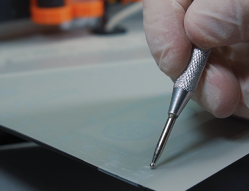
Layout and positioning. Mark label positions lightly with a pencil before opening any transfer sheets. Use a level for horizontal alignment. Some installers use low-tack tape to temporarily hold the label sheet in position while checking alignment from a step back.
Burnishing. Once positioned, apply firm, even pressure across the entire label using a burnishing tool — or the back of a credit card — in small overlapping circles. Begin at the center and work outward. Insufficient burnishing is the most common cause of incomplete transfer. If sections of the lettering begin to lift with the carrier sheet, replace the sheet and burnish again over the affected areas.
Peeling. Peel the carrier sheet slowly at a low angle, nearly parallel to the wall surface. Pull steadily rather than in a single fast motion. If any lettering begins to lift, lay the carrier back down and burnish again before continuing.
The finished result is lettering that sits flush with the wall — only the thickness of the lacquer ink layer separates the text from the paint below it.
What to Expect: The Look, Feel, and Longevity of Transfer Labels
A correctly applied dry transfer produces matte or satin lettering that reads as part of the painted wall — no film, no edge, and no shadow under gallery track lighting. The ink layer is only as thick as a coat of lacquer, imperceptible to the touch. In a multi-month exhibition, the adhesive holds without yellowing, curling, or peeling at the edges.
Dry transfers are semi-permanent installations. The pressure-sensitive adhesive bonds firmly without peeling, yellowing, or losing adhesion at the edges — the failure modes common to paper-backed labels. A clear topcoat of spray lacquer can convert a semi-permanent transfer to a fully permanent finish — ask your supplier for a compatible product recommendation before applying, as some solvents can affect wall paint.
Removal at the end of an exhibition requires wall repainting rather than simple peeling. This is a meaningful consideration for venues that cycle exhibitions frequently. If a fully removable solution is required, vinyl decals or framed card labels are the appropriate choice — with the understanding that neither produces the seamless, painted-on finish of a dry transfer.
For a more technical breakdown, continue below.
Custom Museum Wall Labels vs. Standard Exhibition Labels — What’s the Difference?
Custom museum wall labels are produced from client-supplied vector artwork and manufactured to exact specifications — any font, any color, no substrate. Standard exhibition labels include printed cardstock, adhesive vinyl, foam-core mounted panels, and acrylic gallery labels, each with a visible physical presence. The fundamental difference is whether the label material itself appears on the wall alongside the text, or disappears entirely.
The most visible distinction between custom rub-on museum wall labels and standard exhibition labels is the edge. Every paper card, adhesive sticker, and vinyl decal has one: a physical boundary where the label material begins. This boundary competes for attention with the artwork beside it, and under gallery lighting — especially raking track spots — it casts shadows and catches glare in ways that call further attention to itself.
Custom dry-transfer labels remove that edge entirely. The typography exists on the wall — nothing else does. Beyond appearance, custom production offers precise control over every typographic variable that printed cards cannot match. A standard printed card is limited by your printer’s color gamut and cannot output white ink. A custom rub-on transfer can be produced in any Pantone color, including opaque white for application on dark walls, or metallic tones to complement specific exhibition materials. Every font is reproduced exactly as supplied in the vector file — no substitution, no resolution degradation.
The trade-off is lead time and file preparation. Custom transfers require a vector artwork file with outlined fonts, and a production window of typically three to five business days post-proof approval. Standard cards can be printed in-house the day of install. For exhibition producers who plan installation at least a week out — which is standard professional practice — the timeline is manageable.
Gallery Graphics Beyond the Label: Wall Text, Title Panels, and Didactic Panels
Professional exhibition graphic systems extend well beyond individual object labels. Introduction panels, thematic section headings, didactic panels, artist statements, and exhibition wayfinding signs each serve a distinct interpretive role at a different scale. A single font family across all gallery graphics and custom exhibit signage maintains visual coherence throughout the space. QR code exhibit labels offer an additional layer of digital content without crowding the physical label.
Object labels are one tier in a larger typographic system. A professionally designed exhibition deploys gallery graphics at multiple scales, each serving a different function in the visitor’s interpretive journey.
Introduction panels (A-text) are positioned at gallery entrances and read from a distance. Typography is scaled proportionally to viewing distance — typically 30 points or larger for primary text, with generous line spacing and minimal word count. These panels establish the exhibition’s curatorial premise before the visitor encounters any individual work.
Section labels (B-text) introduce thematic groupings within the larger exhibition. They transition the visitor between interpretive zones and provide a mid-scale text layer between the entrance panel and the work-level labels.
Object labels and tombstone labels (C-text) are the work-level identification and interpretive text that constitute the majority of gallery wall text by count.
Didactic panels and artist statements extend beyond the tombstone format to provide extended context — biographical, historical, or methodological — that object labels cannot accommodate within their word-count constraints.
Exhibition wayfinding signs — directional markers, room numbers, accessibility indicators, and floor maps — complete the graphic system beyond interpretive labels. These are typically produced in vinyl or silkscreen for durability and scale. (Some venues also supplement wall labels with QR codes linking to extended digital content such as audio guides or catalogue entries; these are printed separately and placed below the transferred text rather than incorporated into the transfer itself.)
Gallery signage and art exhibition wall text at every tier should share the same font family and color system, differentiated by size and weight rather than by typeface changes. This typographic consistency produces a coherent visual identity that recedes appropriately, allowing the artwork to remain primary at every scale.
For large-format title text and section headers — where viewing distance demands large letterforms — vinyl-cut lettering or direct-to-wall UV printing is often the most practical production choice. For object labels and fine-detail tombstone text, where resolution requirements are highest and letter sizes smallest, dry-transfer production delivers the clearest quality advantage.
How Do Museums Actually Print Text on Walls?
Major galleries use four primary methods to apply museum wall text decals and lettering: silkscreen printing, wall vinyl lettering, direct-to-wall UV inkjet printing, and dry-transfer rub-on labels. Understanding how museums print text on walls helps exhibition designers match production method to exhibition type, budget, and aesthetic requirements. Each method differs in setup cost, minimum letter size, removability, and visual finish.
Silkscreen printing is the traditional museum standard for permanent and long-term gallery text. A stenciled screen is produced for each label, and ink is pushed through the mesh directly onto the wall surface. The result is highly saturated, durable lettering with no visible substrate — it reads as painted text. The limitation is setup cost: producing screens for dozens of individual labels across a temporary exhibition is prohibitively time-intensive. Silkscreen is cost-effective only for permanent collection galleries or large-format title panels with extended runs.
Wall vinyl lettering is the production standard for temporary exhibition title walls and large-format heading graphics. Vinyl is produced on a plotter-cutter from rolls of colored film. It’s fast, relatively inexpensive, and available in a wide range of colors. It has a practical minimum letter size below which the film tears during weeding, and it leaves a visible plastic edge at all letter boundaries. For detailed object labels with fine typography, vinyl is the wrong tool.
Direct-to-wall UV inkjet printing is an emerging method in which large-format printers on rolling rigs output full-color text and images directly onto the wall surface, with UV-curable ink bonding immediately on contact. This method allows photographic reproduction at monumental scale and is increasingly used for immersive environments. Equipment cost makes it inaccessible for most independent gallery productions.
Dry-transfer rub-on labels combine the seamless finish of silkscreen with the logistical flexibility of vinyl. Produced off-site from vector artwork and applied on-site without equipment or wet materials, they achieve fine-detail resolution — down to 0.4-point keylines — that vinyl cutting cannot match. They are strictly limited to smooth indoor surfaces.
In practice, most institutional galleries use a combination: permanent collection spaces use silkscreen or mounted plaques; temporary exhibitions use vinyl for large title graphics and dry transfers for individual object labels and caption text.
Dry Transfer Labels vs. Vinyl Decals — A Direct Comparison
Dry-transfer rub-on labels and cut vinyl decals are the two most common production methods for temporary gallery wall text. They differ fundamentally in material thickness, minimum letter size, color range, and visual finish. Dry transfers leave only ink on the wall; vinyl retains a physical film layer that produces visible edges and micro-shadows under gallery lighting.
The most consequential difference between dry transfers and vinyl decals is not aesthetic — it’s physical. Vinyl is cut from a plastic film and, once applied, retains that film on the wall surface. The film has measurable thickness. Under raking gallery track lighting, that thickness casts micro-shadows at letter edges that are visible at close range, breaking the illusion of a seamless painted surface.
Dry-transfer lettering deposits only ink onto the wall. No carrier remains. The text is flush with the paint, casts no shadows, and produces no differential gloss under spotlights.
The second significant difference is minimum letter size. Vinyl cutters cannot produce letterforms below approximately 12mm without the film tearing during weeding. Dry transfers, produced photographically rather than by blade, can reproduce text at fractions of that size — down to 0.4-point keylines — which is the resolution range required for the fine typography of exhibition object labels and credit lines.
|
Feature |
Cut Vinyl Decals |
Dry Transfer (Rub-On) Labels |
|---|---|---|
|
Material on wall |
Plastic film + adhesive |
Ink only |
|
Edge visibility |
Visible under raking light |
No edge |
|
Minimum letter size |
~12mm before tearing risk |
Below 0.4pt without quality loss |
|
White ink capability |
Requires specialty white vinyl |
Standard — opaque white is a stock option |
|
Environment |
Indoor and outdoor / exterior |
Indoor smooth surfaces only |
|
Durability |
High — UV and moisture resistant |
Suitable for full exhibition duration indoors |
|
Removal |
Can lift paint |
Wall repaint typically required |
|
Best application |
Large title text, exterior wayfinding signs |
Object labels, fine typography, invisible wall text |
According to the Alaska State Museums Bulletin, the dry-transfer method produces results comparable to silk-screened text for gallery label applications requiring a seamless surface finish (Alaska State Museums).
Custom Museum Placards for Photography, Sculpture, and Mixed-Media Exhibits
Exhibition type determines label production method and format. Art gallery labels for photography exhibitions benefit from white-ink dry transfers on dark or saturated walls. Sculpture and freestanding object exhibits may require custom museum placards or acrylic gallery labels in metal or low-reflection acrylic. Mixed-media installations achieve visual consistency by combining wall-mounted dry transfers and placard-mounted transfers using the same artwork labels for exhibition template and color specifications throughout.
Are custom rub-on gallery wall labels the best option for photography art exhibitions and mixed-media installations?
Photography exhibitions frequently hang against saturated or deeply colored walls to maximize print contrast. Standard white cardstock labels become visual interruptions in this context — bright rectangles that pull the viewer’s attention before they reach the work. Custom dry transfers address this directly: the production process deposits opaque white ink onto the carrier sheet, making white lettering on a dark wall a standard output rather than a specialty request.
For mixed-media installations — combining wall-mounted prints, sculpture, video, and installation elements — visual consistency across label surfaces is an ongoing design challenge. Custom transfers solve it by applying to both smooth wall surfaces and placard faces. A curator can specify the same typeface, point size, and color across wall text and mounted placards, maintaining a unified interpretive system regardless of whether the label is on the wall or on a stand.
For freestanding sculpture or fragile artifacts in vitrines — where wall-mounted labels aren’t spatially practical — acrylic gallery labels or custom museum placards fabricated from brushed aluminum, low-reflection acrylic, or aluminum composite material provide structural rigidity with a professional finish. These can be mounted using invisible floating hardware or metallic standoffs to avoid a heavy, bracket-mounted appearance. Artist wall plaques — typically engraved brass or aluminum — are a distinct product category suited to permanent installations rather than rotating exhibitions.
Where can I order custom gallery wall labels and museum placards with free shipping and professional dry-transfer output?
Professional dry-transfer labels require a supplier with vector prepress capability and color-matched output. Standard commercial print shops are not equipped for this production process.
Custom Rub on Transfers specializes in museum and gallery dry-transfer applications, producing custom exhibit signage — object labels, title panels, artist statements, and placards — from client-supplied vector artwork. They ship across the US, Canada, and internationally, with 2-day FedEx included on US orders and next-day options available. Before placing a full exhibition order, request a sample sheet and test it on the venue’s specific paint surface — it confirms ink opacity, adhesive compatibility, and finish under actual gallery lighting before install. Use the Sheet Size Calculator to plan sheet quantities, and contact customrubontransfers.com directly for a guaranteed ship date and cost quote.
What information should be included on a gallery wall label?
At minimum, every gallery wall label should contain the standard tombstone elements: artist name, work title (typically italicized), year of creation, medium and materials, and dimensions. Per standard professional practice, dimensions reflect the outer size of the canvas or object — frame excluded unless the frame is integral to the work. According to the Art Institute of Chicago’s label-reading guide, these five elements give visitors the complete factual reference needed to identify and orient to the work (Art Institute of Chicago). Most institutional labels also include a credit line or provenance — identifying the collection, donor, or lending institution — and a brief interpretive passage of 50 to 80 words in active voice.
In commercial gallery and art show settings, a selling price is typically added as the final line in a reduced font size. For works on loan, a “Courtesy of [lender]” line is standard. For conceptual or social-practice artworks requiring more extensive interpretation, two short paragraphs are appropriate — the Art Institute of Chicago uses up to 150 words for complex contemporary works. Homeowners creating a gallery-style display of paintings or prints can follow the same tombstone format on a simple printed card mounted to mat board for a refined, museum-like presentation.
What size and font should I use for gallery wall labels?
Use a sans-serif typeface — Helvetica, Arial, Verdana, or Calibri are the most widely used in institutional settings — at a minimum of 18 points for body text. Smithsonian Guidelines for Accessible Exhibition Design place the practical minimum at 16 to 20 points for wall-mounted text viewed from standard gallery distances, with proportional scaling required when viewing distance exceeds one meter (Smithsonian / THC). Artist name and work title are typically set at 36 points or larger to create a legible typographic hierarchy. The J. Paul Getty Museum uses 6 inches as its standard tombstone label width — a practical baseline for most exhibition contexts. Gaylord Archival’s accessible label resources recommend avoiding condensed font weights and visually ambiguous letter pairs (Gaylord Archival). Always proof at the intended point size and test legibility from actual viewing distance before committing to production.
Will rub-on transfer labels damage my walls, and can they be removed?
Dry transfers do not damage walls during installation — no aggressive adhesives, tools, or solvents are involved. The pressure-sensitive adhesive bonds to the wall surface over time, becoming more permanent as it cures. Removal after an exhibition typically requires repainting the labeled areas rather than clean peeling. The AAM Museum Junction forum documents that even products marketed as “removable” — including 3M Command strips and double-sided foam tape — carry real risk of lifting paint from standard drywall finishes on removal. If your venue requires fully removable labeling — a rented space, a historically sensitive surface, or a wall you cannot repaint — framed card labels or vinyl decals are the appropriate choice. Always test on an inconspicuous area first regardless of production method.
What are invisible wall labels for art exhibitions, and how are they different from standard gallery wall labels?
Invisible wall labels are dry-transfer rub-on labels — called invisible because, once applied, only the text remains on the wall. No paper, no vinyl film, no adhesive border, no substrate of any kind. The lettering appears as if silk-screened or painted directly onto the surface. Standard gallery labels — printed cardstock, adhesive vinyl, foam core mounted panels — retain a visible physical presence: you can see where the label material begins and ends. The invisible label removes that boundary entirely. Both formats convey identical information; the difference is entirely in appearance and method of installation. Dry transfers require custom vector artwork files and a production lead time, but they produce a professional gallery wall label finish that framed cards and adhesive labels cannot replicate.
Can I use a museum label template for gallery wall label printing, or do I need custom artwork files?
A gallery label template or museum label template — whether in Word, Google Docs, or a printable PDF — is useful for structuring tombstone hierarchy and checking word counts during the writing phase. For printable gallery labels printed on card and mounted in-house, a template works fine. It cannot be used as a production file for dry-transfer labels. The transfer manufacturing process requires pure vector artwork, supplied as .AI, .EPS, or an outlined .PDF, because the production system physically reproduces your artwork labels for exhibition at tolerances too fine for pixel-based files. All fonts must be converted to outlines before submission so the manufacturer isn’t dependent on your local font installation. For professional gallery wall label printing via rub-on transfer, a vector file is non-negotiable. Some suppliers offer layout assistance for a fee if you don’t have access to vector design software.
What is the difference between museum wall labels, art exhibition labels, gallery placards, and tombstone labels?
These terms are used interchangeably in casual conversation but carry specific meanings in curatorial practice. A tombstone label refers specifically to the factual data block — artist, title, date, medium, dimensions, credit — without interpretive text. The term comes from the resemblance to gravestone inscriptions: concise, factual, identifying. An object label or didactic label includes tombstone data plus a brief interpretive passage. Wall label is the catch-all term for any caption placed adjacent to an artwork on the wall, regardless of length or format. A gallery placard typically refers to a freestanding or mounted physical panel — more common in commercial galleries and for sculpture applications where a wall-mounted label isn’t spatially practical. A title panel or introductory panel is distinct from all of the above: large-format text at the entrance to an exhibition or gallery section, not adjacent to a specific work.
How do rub-on dry transfer labels compare to vinyl wall decals and silk screen printing for museum wall text?
For museum wall text application, each method occupies a different position on the cost, quality, and permanence scale. Silkscreen printing produces the highest-quality result — saturated, durable, completely seamless — but requires screen production for each individual label, making it economically viable only for permanent collection galleries or long-run title panels. Cut vinyl decals are fast and widely available but limited to letter sizes above approximately 12mm and always leave a visible plastic edge under gallery lighting. Dry-transfer rub-on labels occupy the practical middle ground: they achieve a silkscreen-like seamless finish without the setup infrastructure, reproduce fine typography at sizes vinyl cannot reach, and can be applied on-site without specialized equipment. The Alaska State Museums Bulletin specifically documents dry-transfer lettering for gallery wall applications where a painted-on finish is required (Alaska State Museums).
For temporary exhibitions with fine object labels, rub-on transfers are typically the most practical path to a professional result.
Are custom rub-on gallery wall labels the best option for photography art exhibitions and mixed-media installations?
For photography exhibitions and mixed-media installations, custom rub-on labels address the two most common label production problems simultaneously. Photography galleries frequently use dark or saturated wall colors to maximize print contrast — a setting where white cardstock labels become distracting visual rectangles. Custom dry transfers can produce opaque white lettering on any wall color, which standard printers cannot. For mixed-media installations with both wall-hung and freestanding elements, custom artwork labels for exhibition can be applied both directly to walls and to placard surfaces using the same artwork file, maintaining typographic consistency across every surface type. That said, for outdoor sculpture gardens, exterior exhibition spaces, or environments with high humidity, vinyl or UV-printed custom exhibit signage is more appropriate — dry transfers are strictly an indoor solution.
What museum label examples, standard sizes, and font specifications do professional curators recommend?
Institutional style guides provide specific benchmarks. The J. Paul Getty Museum’s guide specifies standard tombstone label dimensions at 6 inches wide by 4.5 inches high for object-only labels, expanding to 6 by 7.5 inches when 30 to 70 words of interpretive text are included (Getty). For font size, Gaylord Archival’s accessible label resources set the practical minimum at 18 points for body text, with headings set proportionally larger for visual hierarchy (Gaylord Archival). Helvetica, Arial, and Verdana are the most cited typefaces across institutional style guides. The Canadian Museum for Human Rights uses 30-point bold for label headers and 24-point for body text as its accessible baseline.
Museum label examples across institutions consistently favor left-justified, mixed-case body copy on a high-contrast background — practices that align with both WCAG digital accessibility standards and the physical readability demands of gallery lighting.
Where can I order custom gallery wall labels and museum placards with free shipping and professional dry-transfer output?
Professional dry-transfer production requires a supplier with vector prepress capability, color-matched output, and direct experience with museum and gallery applications. Standard commercial print shops are not equipped for this process. customrubontransfers.com produces custom rub-on museum wall labels and placards from client-supplied vector artwork, with 2-day FedEx shipping included on US orders and next-day options available for urgent installs. When you’re ready to purchase, use the Sheet Size Calculator to plan your label quantities before ordering.
Contact customrubontransfers.com directly for a guaranteed ship date and cost estimate — you’ll receive a quote with your order description and confirmed ship date in minutes, with no waiting period. File specs to confirm before submitting artwork: vector format (.AI, .EPS, or outlined .PDF), fonts converted to outlines, and color specifications in Pantone or CMYK for exact color matching.
Contact Us
Have questions about artwork setup, sizing, production times, or custom orders?
Our team is happy to help with file preparation, transfer recommendations, shipping questions, and project quotes.
Contact Custom Rub On Transfers and we’ll respond as quickly as possible during business hours.
About the Author
The Custom Rub On Transfers Team specializes in custom dry-transfer decals, museum wall labels, precision rub-on lettering, and custom graphics for galleries, exhibitions, businesses, artists, and creative professionals.
Our team works daily with vector file preparation, typography setup, color matching, production workflows, installation methods, and custom transfer applications across a wide range of surfaces.
We publish educational resources to help customers understand production options, avoid common artwork mistakes, and achieve professional results with custom transfers.
Why Trust Us?
Custom Rub On Transfers focuses exclusively on custom dry-transfer decals and rub-on lettering. Our educational content is based on real manufacturing experience, customer projects, production problem-solving, and hands-on knowledge gained from creating custom transfers for professional and creative applications.